Knowles says:
I think you see in Comics that slick artists who have weak basic drawing skills but have a knack for decorative detail are usually the fan favorites. I think the fact that the superhero audience is getting older accounts for the growing popularity of photo-tracing and "widescreen" artists- older fans are more sophisticated in their visual tastes and want the patina of film and photography (and perhaps "maturity") in their comics.
I actually take issue with a couple of the claims in this paragraph.
First, the assertion that "young" readers (the fan favorite reference is specifically directed at young in this paragraph even though comic fans are getting older) like "weak basic drawing" with decorative detail seems to me a straw man. It isn't the "decorative detail" that the fan enjoys in Liefeld's artwork, it is the sense of action. As much as I mock Liefeld's anatomy, and it is laughable, his artwork has movement and the action leaps from the page. It is as if he completely absorbed the panel design lessons in How to Draw the Marvel Comics Way, but ignored the section on backgrounds and anatomy. In a section I didn't quote, Knowles mentions the young fan's enjoyment of Manga. While I will concede that the "people" in manga lack anatomic accuracy the backgrounds and mechanical drawings don't, and are in fact often quite accurate and detailed. Once again it is the action leaping out of the page that is attractive.
The second claim is that older readers "want the patina of film and photography." I think this is mere speculation. While some older readers may desire a more photographic representation, possibly seeking distance from the narrative, others do not.
Let me step back from that sentence a second and unpack part of it. What do I mean by "seeking distance from the narrative?" To simplify, in Understanding Comics Scott McCloud argues (claims, posits, whatever) that the more generic the representation of a particular graphic representation of a "person", the more people (numerically) will empathize with the character or project themselves into the characterization. Smiley face versus particular face. Hence why traditionally (Golden and Silver Age) villains are more distinctive than their heroic counter parts, it guides the readers into imagining themselves as the heroes. Thus a more realistic looking narrative would be less "interactive" and more "voyueristic". As is pointed out in Making Movies Work by Jon Boorstin we watch movies (I would argue we also read comics) with three "eyes," the voyueristic eye (the most critical), the vicarious eye (where we are involved in the characters emotionally), and the visceral (where we become a part of the narrative). The action oriented style of manga, when combined with compelling action, appeals to the visceral eye and thus need not be as accurate on a technical level to satisfy the reader (regardless of age).
What Knowles is claiming is essentially that adults have become so jaded to comic narrative that they can no longer become a "part" of the narrative and thus need more realistic representations. The statement about more "maturity" leads one along this logical path as well. But if Boorstin's model is correct, the supposedly more "mature" stories must be less compelling. Because if we are so much in need of realism that our voyueristic eye is being critical, the narrative is not engaging or is less engaging than otherwise. Besides, look at some of the award winning writing like Powers (a series I very much enjoy) and the art work is stylized and not realistic at all. What it is is compelling. Not that Mike Oeming isn't artistically talented, he is--very much so, but he isn't hyperrealistic.
In addition to disagreeing on a "theoretical" level with Knowles, I also disagree on an aesthetic level. As a child, I was enthralled by the works of N.C. Wyeth and Mucha and while I liked Liefeld's Hawk and Dove (which is by the way some of his most "sophisticated" art), I still found him to be an uninspiring artist. Mucha and Wyeth used technique to make a non-sequential narrative visceral, Liefeld needs the sequential. If the fights don't draw you in, Liefeld fails. Fights without reason, even in a superhero book which are all about epic battles, are boring and bad narrative thus Liefeld's art fails to satisfy. What made Liefeld a fan favorite was that he worked on interesting books. One of the things I noticed reading through old issues of X-Force was that Nicieza essentially ignored Liefeld's panels and inserted tons of dialogue as narrative. Fabian Nicieza wrote a funny soap opera, that happened to have Liefeld artwork. I don't think I even noticed the art the first time I read it, and even now in an age when I don't like Liefeld I still find these issues fun.
All of this having been said, Knowles and other Liefeld critics (who I count myself among) are right to discuss the difference between mere flashy illustration and genuine art. The best stories (in film) satisfy all three of our eyes. The best images can endure our voyueristic eye. But that doesn't mean they have to be photographic.
Let's face it...this is pretty bad.
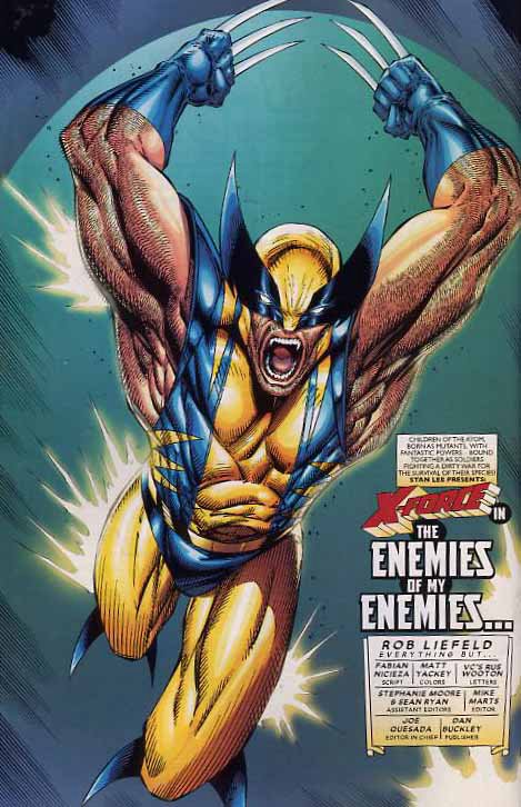 But this...
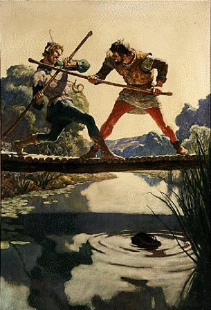 And this...
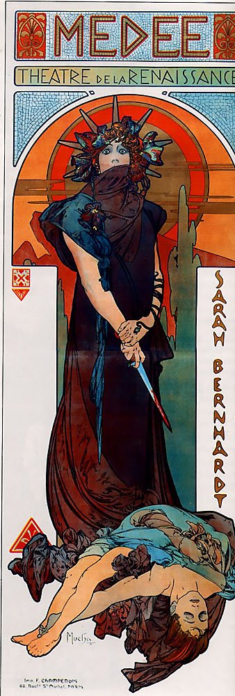
...are pretty remarkable.
As is...
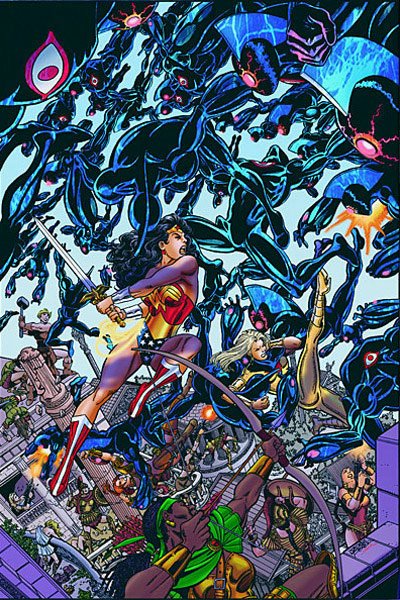
But then ...George Perez has always been a "FAN FAVORITE" and I don't link it is for his "weak basic drawing skills."
No comments:
Post a Comment