

Peer Reviewed Political Science Could Be More Accessible
A Look at Abramowitz's and Webster's (2015) Discussion of The Way People's Feelings About The Other Political Party Influences Their Likelihood to Vote Straight Ticket for Their Party

One of my goals in creating this Substack was to write about Popular Culture from a variety of perspectives. My interests are broad and I wanted to share my thoughts on those broad interests with anyone who might find them interesting. Popular Culture contains many aspects, ranging from film and tv to music to table top and video games to politics. All of these and more make up our culture. I want to discuss all of these things on this Substack and I want to do so from uncommon angles. If you want to read a rant on the current hotness, I might not have an article on it. If you are interested in alternative rules, looking at “how” roleplaying games emulate things, or references to Stanley Cavell’s concept of “Remarriage Films” and how/whether a film engages what Boorstin called “The Voyeuristic Eye,” then this is the place for you.
That desire to talk about all aspects of popular culture is why I’m taking a moment to talk about politics today, in particular Political Science.
Political Scientists are very good at analyzing politics, but in general they are very bad at communicating their analysis to a wider audience. There was a period of time when some far sighted Political Scientists decided to correct this phenomenon by creating blogs written with a public facing sensibility. Some of the best blogs along these lines are Mischiefs of Faction and The Monkey Cage, but the number of academic blogs directed at a popular audience has definitely declined from its heyday in the early 2010s. There is a need for more public facing platforms for Political Science.
I was struck by this when discussing a very good article by Abramowitz and Webster on the rise of negative partisanship1, that form of partisanship that is about hating people in the other party rather than about being proud of your own, with a group of undergraduate college students. The article makes a number of excellent arguments, but one of the key arguments is that having negative feelings about a political party (i.e. a Democrat hating the Republican party) was a more powerful predictor of whether someone would vote straight ticket than being a Strong or Weak Partisan. The reason they were looking at this question is that even as we have more people claiming to be “independents,” we also have higher levels of political polarization. This rise of independents = rise in polarization phenomenon doesn’t make sense on the face of things, so they wanted to see if they could explain it.

One of the first things they discuss is how independents aren’t really independent. When you ask a follow-up question forcing someone to tell you whether they feel closer to one party or the other, they usually have an answer. Whatever that answer is (“I’m an independent, but I feel closer to the Democrats”) is highly suggestive of how they will vote. These “leaners” behave more and more like partisans.
All of that was easy to understand by my students and clearly written, but then came the section on “negative partisanship and voting behavior.” In that section, Abramowitz and Webster discuss the analysis they did (logistic regression analysis of party loyalty using data from the American National Election Studies Survey) and present tables of output that includes coefficients.
Here is the first of these tables.
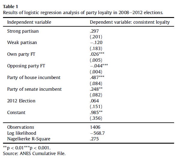
I can already see your eyes rolling into the back of your heads and I am rehearing the sighs of frustration and confusion from the undergraduate students. “What the HELL is logistic regression analysis?” and “What in God’s name to those numbers mean?” I’m sure that you can understand that more stars (***) means that the finding more important. It’s an illustration of “significance,” but fair enough. I’m also sure that you can probably recognize that bigger numbers might mean “bigger effect.”
Not exactly. Thought Abramowitz and Webster write:
Not surprisingly, voters were more loyal to their party when there was a House incumbent or a Senate incumbent from their own party and less loyal when there was a House incumbent or Senate incumbent from the opposing party. Somewhat surprisingly, strength of party identification had little or no influence on loyalty after controlling for the other predictors in the model. Most importantly for our theory, feeling thermometer ratings of the opposing party were by far the strongest predictor of party loyalty.
Feeling thermometers of the opposing party were by far the strongest predictor of party loyalty? But that number is tiny. I mean .487 is greater in magnitude than -0.044, right? They’ve both got three stars, so they must be just as important and one is bigger. What’s going on and what isn’t discussed?
Well the first thing that isn’t discussed is what those numbers mean. They just expect you to know what logistic regression coefficients mean, that’s what those numbers are, and how to think about them. Given that proper interpretation of logit coefficients includes transforming them into odds ratios by taking the inverse log of those odds ratios then with another quick step to transform that into percentage likelihood is required to see the effect of those coefficients, they haven’t really said anything. If, as I told my students to do, you keep in mind that the Incumbent variables range from - 1 to 1 while feeling thermometers range from 0 to 100, you might be able to conceptualize that -.044 * 100 is greater in magnitude than .487. But the article doesn’t talk about that, nor does it illustrate the effects of these coefficients.
What do they mean? How could they show that?
It’s not that hard to show the effects and a couple of quick illustrations will suffice. I’ll provide the R-code for you to be able to play around with the representations as you see fit. What we have here are 7 variables that might influence whether someone is a “party loyalist,” aka votes straight ticket. Whether they are a strong partisan or a weak partisan (no leaners here), how they feel about their own party and the opposing party, whether the House Member or Senator incumbent is in their party or not (incumbency matters to voters even when they are of the other party as Joe Manchin demonstrates), and whether this is the 2012 election or not. That last one was thrown in to see if behavior was consistent across elections. It is. We can tell this by the lack of stars, or by graphing it which is what I’m going to do. I’m going to do a few quick graphs that isolate the influence of some of these variables.
These graphs will be plotted in R and I’ll include the code to do the plot below.
First, we’ll create default numbers for each variable. Feeling thermometers are variables ranging from 0 to 100 where someone says how warmly they feel about something on that scale with 0 being cold and 100 being very warm. The incumbent variables are coded -1 if the incumbent candidate was of the opposing party, 0 if the seat had an open election, or 1 if the candidate was of the same party. I’ve created these baselines so we can illustrate the effects of manipulating any one of these later.
# Manipulatable Values

strong_partisan <- 1 # Either 1 Strong or 0 Not Strong
weak_partisan <- 0 # Either 1 Weak or 0 Not Weak
own_party_ft <- 50 # 0 to 100 how warm they feel about own party
opposing_party_ft <- 50 # 0 to 100 how warm they feel about opposing party
house_incumbent_same_party <- 1 # - 1 opposing party, 0 open seat, 1 same party
senate_incumbent_same_party <- 1 # - 1 opposing party, 0 open seat, 1 same party
election_2012 <- 1 # 1 if 2012 election 0 for 2008
Instead of going step by step, which will only interest some of you, I want to show you the effect of each feeling thermometer (ranging from 0 to 100) starting these baselines. In other words, when showing the effect of one’s feeling towards their own party, I’ve set the opposing feeling thermometer to 50 (neither hot or cold) and when showing effect of feeling towards the other party I’ve set the own feeling thermometer to 50 as well. It is possible to do it for all values, but I wanted to isolate the effects for a moment.
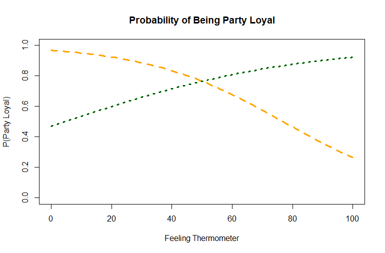
What we see here is that the warmer someone feels about the opposing party (the yellow line) the less likely they are to vote single ticket and the warmer they feel about their own party the more likely they are to do so. You’ll notice that the effect of feeling towards the other party has more movement and is thus stronger.
Visualizations like this are easiest to understand when we only manipulate one variable at a time. If you want to play around with this a little, I’m providing the code below. All you have to do is change the variables above, to see the effect of those changes. For example, I defaulted to incumbents of the same party in both the House and Senate. What would it look like if I changed those from 1 to -1 (opposing party)?
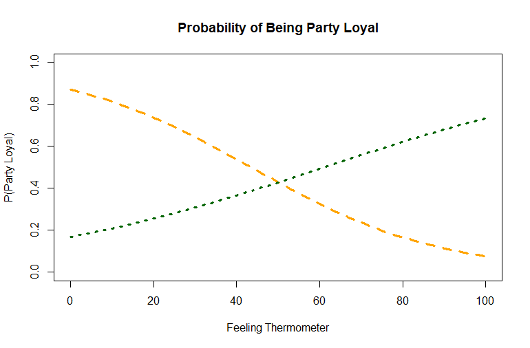
In this case, the true “independent” (a feeling thermometer of 50 for “own” party) would range from about 86% likelihood of voting straight ticket to 5% straight ticket depending on how they felt about the other party. This would be an “Independent Republican” who lives in a Blue district in a Blue state, who feels neither warm nor cold towards Republicans. The yellow line is feeling about out party and the green line is feeling about own party again. Comparing the pictures, you can see the difference in how the variables interact.
Now, I’m not saying that my quick Substack analysis here is better than the Abramowitz and Webster article. I don’t think it is. I don’t even think I’ve gone into enough detail about how to interpret the coefficients, see I told you we Political Scientists were bad at this. I do think that I’ve shown an illustration of the actual effect that changes in feeling thermometers have on a voter’s likelihood of voting straight ticket. Seeing the change in “percentage likelihood” is relatively intuitive and I think easier to interpret.
A graph of a logit curve doesn’t look like it would look if it was a normal “linear” regression where an increase of one in the feeling thermometer would result in a change on the y axis equal to the coefficient. That’s not how logits work. You have to multiply the variable by the coefficients, sum that value, transform them by taking the inverse log of them, then put that in a probability equation. It’s a really useful analytical tool, but just showing the coefficients doesn’t tell much of a story. It’s much better to show a visual of the effect.
It’s only in doing things like this that we can help non-Political Scientists understand what our research is telling us. It’s one thing to say that how one feels about the opposing party matters more than whether one considers themselves a strong partisan or not and point to abstracted numbers, it’s quite another to show an illustration of that point in pictures.
Feel free to play around with it yourself.
Here’s the rest of the code if you want to experiment (I’ve also done this in Excel because why not):
# Model a Consistent Loyalty Coefficients

strong_partisan_coef_a <- .297
weak_partisan_coef <- -.120
own_party_ft_coef_a <- .026
opposing_party_ft_coef_a <- -.044
house_incumbent_party_coef <- .487
senate_incumbent_party_coef <- .248
election_2012_coef <- .064
loyal_constant_a_coef <- .985

# Effect of In Party FT

opposing_ft_range <- seq(from = 0, to = 100, by = 1)


a_strong <- strong_partisan_coef_a * strong_partisan
a_weak <- weak_partisan_coef * weak_partisan
a_own <- own_party_ft_coef_a * own_party_ft
a_opposing <- opposing_party_ft_coef_a * opposing_ft_range
a_house <- house_incumbent_party_coef * house_incumbent_same_party
a_senate <- senate_incumbent_party_coef * senate_incumbent_same_party
a_2012 <- election_2012_coef * election_2012
a_constant <- loyal_constant_a_coef

a_logits <- a_constant + a_strong + a_weak + a_own + a_opposing + a_house + a_senate + a_2012

# Effect of Out Party FT

own_ft_range <- seq(from = 0, to = 100, by = 1)

b_strong <- strong_partisan_coef_a * strong_partisan
b_weak <- weak_partisan_coef * weak_partisan
b_own <- own_party_ft_coef_a * own_ft_range
b_opposing <- opposing_party_ft_coef_a * opposing_party_ft
b_house <- house_incumbent_party_coef * house_incumbent_same_party
b_senate <- senate_incumbent_party_coef * senate_incumbent_same_party
b_2012 <- election_2012_coef * election_2012
b_constant <- loyal_constant_a_coef

b_logits <- b_constant + b_strong + b_weak + b_own + b_opposing + b_house + b_senate + b_2012

# Probabilities

probability_loyal_a <- exp(a_logits)/(1 + exp(a_logits))
probability_loyal_b <- exp(b_logits)/(1 + exp(b_logits))

# Plots

# Plot for Changes in Opposing Party Feeling Thermometer
plot(opposing_ft_range, probability_loyal_a,
     ylim=c(0,1),
     type="l",
     lwd=3,
     lty=2,
     col="orange",
     xlab="Feeling Thermometer",
     ylab="P(Party Loyal)",
     main="Probability of Being Party Loyal")

# Add the line for Changes in to Own Party Feeling Thermometer
lines(own_ft_range, probability_loyal_b,
      type="l",
      lwd=3,
      lty=3,
col="darkgreen")Abramowitz, Alan I. and Webster, Steven (2016). “The Rise of Negative Partisanship and the Nationalization of U.S. Elections in the 21st Century.” Electoral Studies 41 pages 12-22.