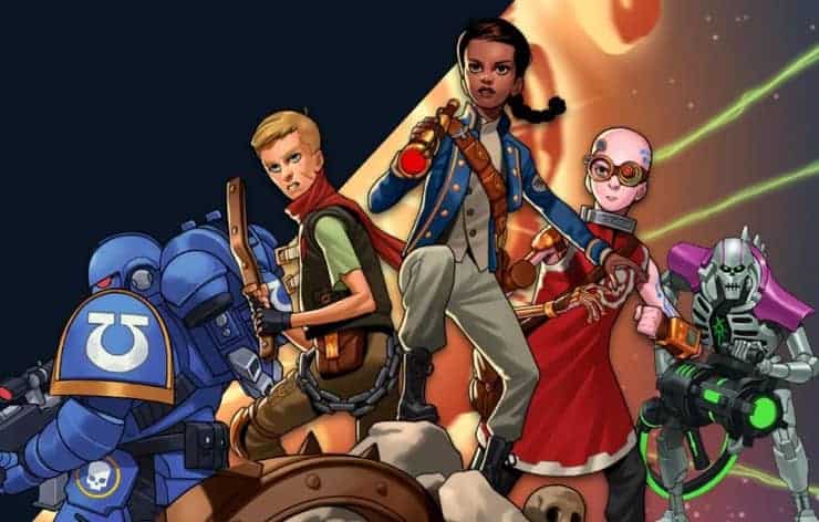
On the Independent Fantasy RPG Front
Jason Vey has long been a part of the OSR community. He was a part of the OSR community before there was an OSR community, back when it was people making house rules for Original D&D and trying to figure out how to use Chainmail as the combat system. Using Chainmail for combat was my first Substack post because I always attempt to be super topical. Over the years Vey has created a number of variant rules for Original D&D and has even released his own fantasy heartbreaker, a heartbreaker that was successful enough that Vey has built a community of fans and expanded his design efforts. I’m among those fans and not only did I purchase Spellcraft & Swordplay, his OSR fantasy heartbreaker, I backed his modern horror rpg Night Shift on Kickstarter (you can buy Night Shift at DriveThruRPG or at the Elf Lair Games website).
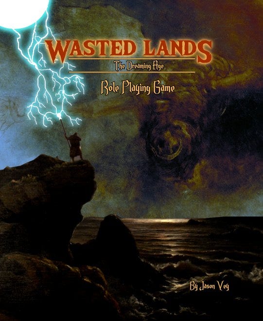
Vey is currently designing a new fantasy role playing game called Wasted Lands: The Dreaming Age that includes an interesting setting and, in true Grognard fashion, allows players to use both of the rules sets he’s designed (O.R.C.S. and O.G.R.E.S.) each of which captures a slightly different feel of fantasy and both of which I enjoy. In an industry dominated by Hasbro, but which has plethora other options to choose from, I recommend checking out Vey’s game.
Sorry, No Math Video This Week
I will however be doing a video where I analyze the Ben Milton’s claim that B/X D&D uses a 5% increase in ability per level rule. That will have regression analysis in it, so if you like math that’s going to be the one for you.
Comic Book News
On the Fantasy Comic Beat
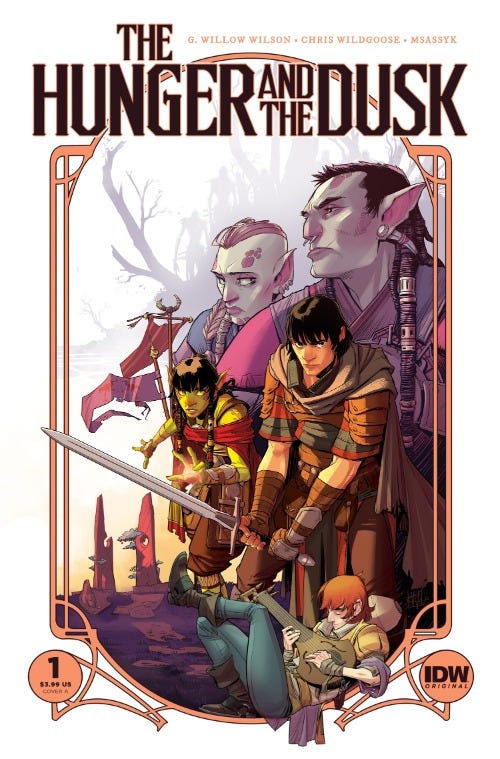
This July will see the release of The Hunger and the Dusk by writer G. Willow Wilson (Ms. Marvel, Wonder Woman, Poison Ivy) and Chris Wildgoose (Batgirl: Rebirth, Batman: Nightwalker). It looks to be an interesting take on traditional fantasy conflicts where the two archetypical D&D style rivals, humans and orcs, must work together against a greater foe.
In a dying world, only humans and orcs remain, mortal enemies battling for territory and political advantage. But when a group of fearsome ancient humanoids known as the Vangol arrive from across the sea, the two struggling civilizations are forced into a fragile alliance to protect what they have built.
As a gesture of his commitment to the cause, the most powerful orc overlord, Troth Icemane, sends his beloved cousin, Tara, a high-ranking young healer, to fight alongside brash human commander Callum Battlechild and his company of warriors. With a crisis looming, the success of this unlikely pair’s partnership and the survival of their peoples will depend on their ability to unlearn a lifetime of antagonistic instincts toward one another…and rise above the sting of heartbreak.
Two Classic Marvel Series Getting New Omnibus Editions
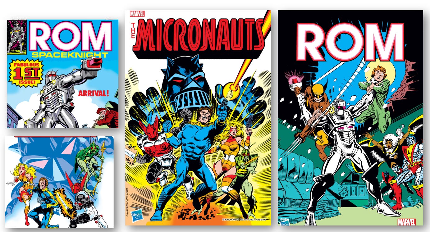
Marvel recently announced that they would be publishing a ROM the Spaceknight Omnibus in January 2024 and a Micronauts Omnibus in April 2024 that will reprint the original series from the 1970s and 80s for a new audience. ROM has long been a personal favorite and the most recent Ant-Man film featured one character from the Micronauts. I wish that the film rights weren’t as complex as they are because I would have loved to have seen the full Micronauts team in Quantumania.
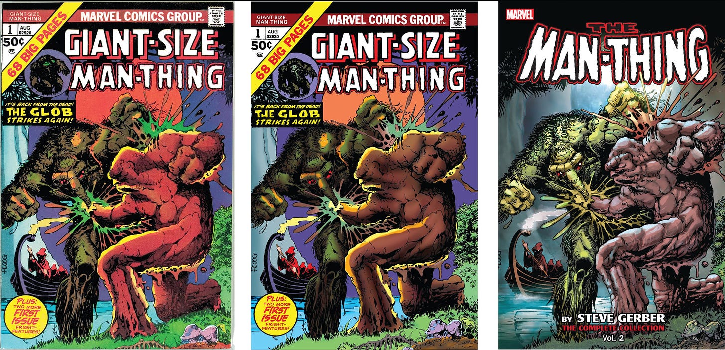
On another note, I think that Marvel would be well served to follow in the footsteps of DC Comics when it comes to Omnibus reprints. DC recently released Absolute Swamp Thing collecting Len Wein and Bernie Wrightson’s iconic version of the character. This collection was painstakingly recolored by José Villarrubia who is on a personal mission to color correct reprints of older comics to recapture the artistic intent in those older issues. If you look at the promo artwork for the upcoming Micronauts and ROM omnibus editions, you will see that they look extremely saturated. The colors are very bright. As Villarrubia has argued and demonstrated on hundreds of occasions, the art in the 70s comics was much more muted due to the newsprint used. The artists new the limitations of the medium, imagine that, and colored with intention that included that knowledge. I’m including one of Villarrubia’s many examples of how something should be colored below. You can see how subtle the older colors were and how they accentuated the line art in a way that is lost with the more saturated effect. I highly recommend buying the Wein/Wrightson Absolute Swamp Thing and I’ll be checking out his new series Dead Romans.
Weekly Luke Y Thompson Review Cavalcade
Those of you who watched my first YouTube conversation video know that Luke Y Thompson is a critic and a friend. He’s been covering the geek beat for a long time and has some great insights and strong opinions. I plan on having him on my YouTube channel once a month for his insights and for the good conversation. It’s not often you can talk with someone about Truffaut, Freddy Krueger, and He-Man, but when you get the chance you take it (ed: We have not yet talked about any of those things on video). I’m including the video below and a rundown of his articles this week.
A Discussion of Jason Statham’s Appeal to Audiences — An Article for A.V. Club
Lego Pac Man Classic Arcade Cabinet Set — A Review for SuperheroHype.
McFarlane Toys New Flash Movie Toyline — A Review for SuperheroHype.
Classic Movie Recommendation
The Shop Around the Corner (1940)
This week’s episode of Ted Lasso featured a clip from Nora Ephron’s highly endearing film You’ve Got Mail and it reminded me that I need to do a video review of it and one of the films that inspired it (separate reviews of course), The Shop Around the Corner.
In addition to my day job, and blogging for a hopefully growing audience, I am an Adjunct Professor of Political Science at Boise State University. In typical “attempt to be cool” professorial fashion, and because I am obsessed with pop culture, I frequently make film and tv references in class. Unlike many professors though, I don’t limit myself to the films of my youth. I reference things the students are currently watching and I drop a lot of classic film references. I end every semester with an Ask Me Anything session with the students.
At the end of the fall semester, one student (who knew my favorite genre was Romantic Comedies) asked what my favorite Romantic Comedy was. After a brief rant, okay not so brief, about how we are in a downcycle of Romantic Comedies (there are some good ones, but we aren’t anywhere near a peak cycle in terms of innovation/heartstring pulling/humor), I said that I don’t have a favorite. Naturally the student pushed back and asked me to give a meaningful answer, to which I replied that I think The Shop Around the Corner is one of the best and most important Romantic Comedies ever made. Not only was it remade, by the same director, as In the Good Ol’ Summertime (also excellent), it served as the inspiration for You’ve Got Mail. It’s a compelling story on many levels and one that has layers of subtlety beyond the core romance if you are willing to look. It’s a film I watch every year at Christmas time, since it is a Christmas film…even more so than Die Hard.

